With that out of the way, those of you [At Northwestern] that did manage to have fun on Halloween were probably at The Keg. If you weren't there, I apologize. If you were there; however, I hope that before you attended, you saw the flyer on Facebook. And if you saw that, I hope you saw the little DSD logo in the bottom lefthand corner.
I put a lot of work into that flyer and I thought I'd outline what exactly this "work" means:
1. Failure - I made a flyer in about an hour before the Phi Delt Halloween party [lots of fun, go to Mathletes and Athletes on Saturday] and I kind of ruhed it because I thought of it as a rough draft. Apparently it wasn't one, so this got submitted to FB.
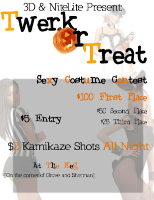 [As always, click the image for a bigger version]
First things first, I don't like putting out any less than 100%[This is not true. I am perfectly content with 75% as long as people think and appreciate it as 100% ...but don't tell anyone] But this, DSDarlings, was absolute trash. Why?
That's how I felt. So I decided to fix it. I got to work on another flyer and thought, "Think fast. How are you going to do this?"
And here is what I thought[fast]:
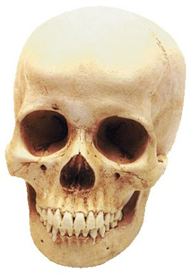
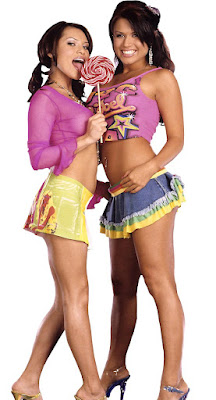
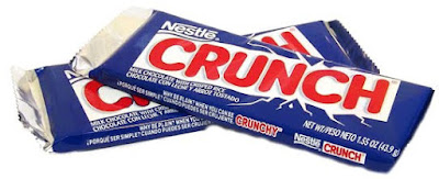
- The fonts didn't look very Halloween-y
- The text was very random and there was no real pattern or grid explaining where they were placed.
- The girls were cute [except the one in the referee suit, take a close look at her face...] and wearing costumes, but they were in random-ass positions and I don't like random randomness [planned randomness is okay].
That's how I felt. So I decided to fix it. I got to work on another flyer and thought, "Think fast. How are you going to do this?"
And here is what I thought[fast]:
- Candy
- Booty
- Twerkin
- Scary but not too scary... sexy scary?
- Orange
- Black
- Breasteses


There were a couple more type of candy included in the final cut, but you get the picture.
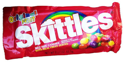
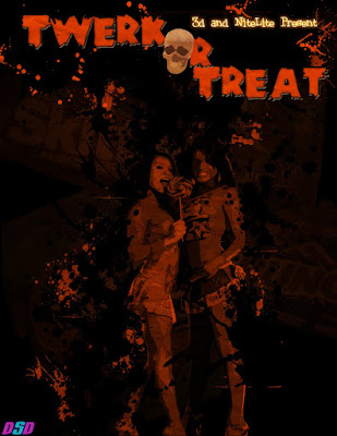
After staring blankly at my screen for a while, I thought I'd make a bunch of bags of candy the background of the image and then make their color scheme black and orange. Then I put the girls in the middle of the picture, but they didn't quite look right. They were drawing attention away from the title and I also didn't find either of them particularly attractive. Rather than erasing them or shopping bags over their heads, I used the cutout filter to make them look a little more "cartoon-y" and then changed their colors to black and orange as well. Then I added the text and that was that.
4. Retouching - The picture still didn't look right. It was just text kind of floating with some girls in the middle on top of some candy. So what I decided to do [as always] was add layered splatters in orange and black. If I put a splatter above the girls and below them as well, it'd look like they were surrounded by it and it would give the picture a lot more dimension.
I did that.
Still wasn't feeling it.
So I decided that maybe putting a bag over their heads was a good idea. I took a picture of a brown paper bag or just some wrinkled paper and pasted it on top of the rest of the picture.
And that was basically it. I liked this picture a lot, but I guess what I like doesn't really matter much when designing something for a client. Big ups to James and Dallas for letting me do the job. I appreciated that. And here's the final picture.
[Please, please, please click the picture and look at it full resolution. It's a huge difference that you can't see on Facebook]


0 comments:
Post a Comment